
Design through the Decades | The 1950’s
When it comes to graphic design in the 1950s, the aesthetic is a rainbow of eye-popping pastels. However, just like today, there wasn’t any “one” look. Some looks became timeless classics as they gained popularity when technology, tastes, and social mores evolved.
Design Purpose
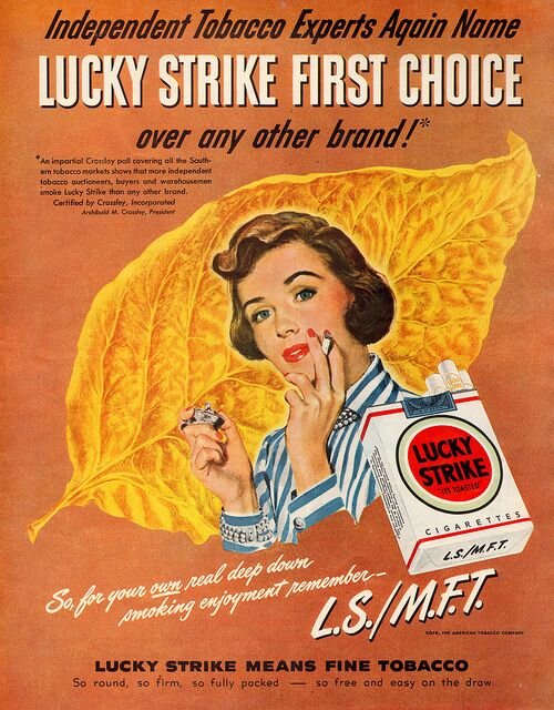
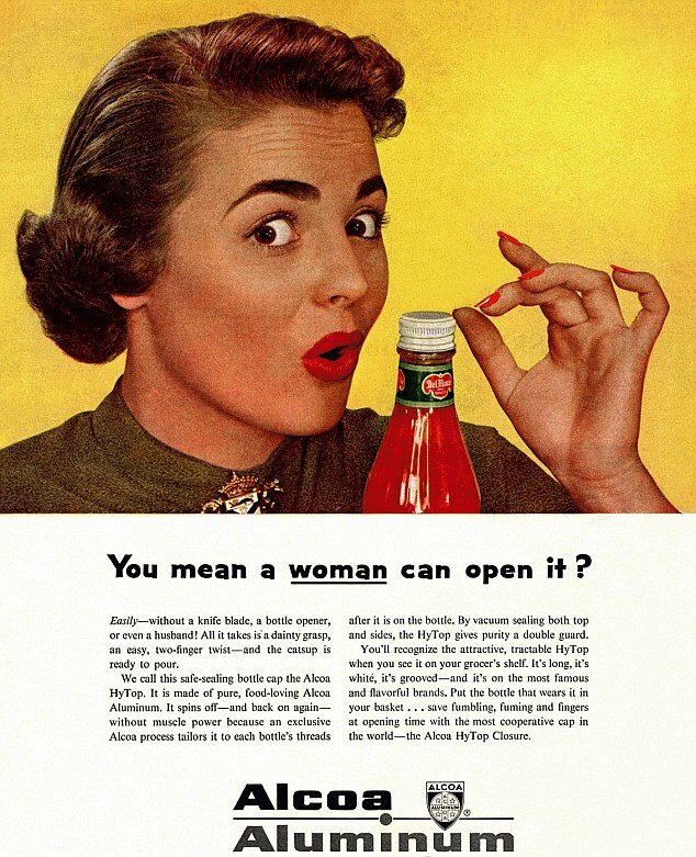
Graphic design in the 1950s was a period of “perkiness.” There were no warnings on cigarette packs. Women loved to do household chores in pearls and heels. Strong, vibrant colours were used to convey satisfaction and wealth. We’ve come a long way from that time.

Design Style
The 1950s was the post-war era, so designers developed a feeling of idealism. After all the horror and tragedy of the second world war, the design shifted to accommodate the need to rebuild and reconstruct, making things more open and democratic. As a result, there was a sense of social responsibility among designers. Many experiments were happening. The high modernist period started to be broken down, rationalised and codified. The so-called “international typographic style” or Swiss-style emerged.
Moreover, as Swiss designers were driving innovations in the 1950s, Helvetica was also invented during this period. This was because there was a need for rational typefaces that can be applied in all kinds of contemporary information. Whether it's sign systems or corporate identity, there was a need for the visual expressions of the modern world to be accessible to the public in an intelligible, legible way.
Influentical People

Cipe Pineles, CHARM Magazine cover, 1954.
1950s graphic design was dominated by American innovations inspired by European Avante-Garde modern approaches. Because of this interesting development, several influential designers emerged, and American designers created a unique style during the period.
Cipe Pineles
Cipe Pineles is one of the most prominent designers in the 1950s whose design portfolio extends over a lot of high profile magazines, such as Vogue and Seventeen. There were also a lot of firsts in her career. She’s the first female designer to be a member of the Art Directors Club in New York. She’s also the first autonomous female art director for a magazine. She was also the first designer to hire fine artists to illustrate mass-market publications, which later on shaped the magazine design industry.
Paul Rand
Paul Rand is undeniably one of the biggest names in the design world. He’s a pioneering figure who is credited to have “visually transformed” American graphic design by developing radical new methods of approaching advertising, logo creation, and design. By adopting what he called the “problem-solving” approach, he facilitated the removal of copywriting from the principal position in design. He placed it on the same tier as design and suggested that by simplifying the amount of type, you are letting form and function interact. Rather than letting the two elements overpower each other, the design would work better if they complement each other.
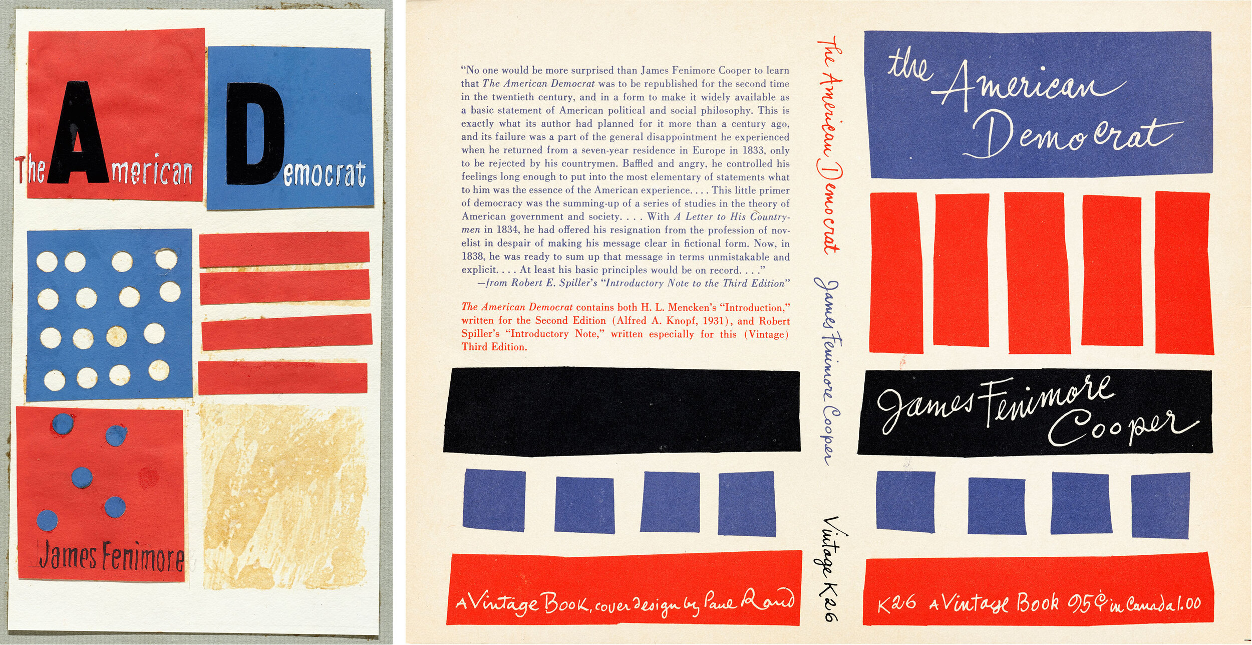
Paul Rand, Sketches and final cover for The American Democrat, Vintage Books, 1956.
He synthesized the ideas of European avant-garde art movements, such as Cubism, Constructivism and De Stijl to produce his own distinctive graphic language. He also served as an art director, teacher, writer, and design consultant to companies such as IBM and UPS. All in all, he was a major force and influence in the field of graphics and visual communication.
Saul Bass
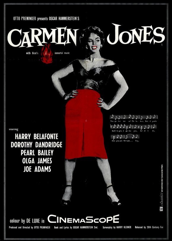
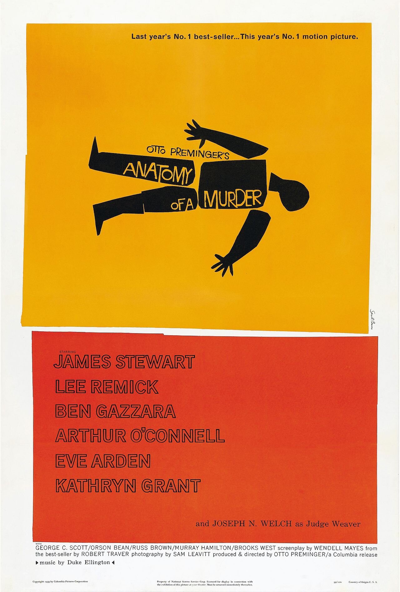
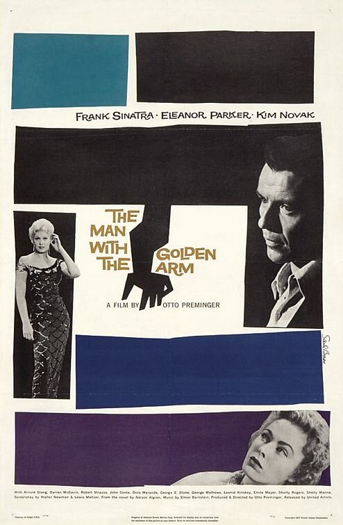
Saul Bass is a household name in the world of design. He’s a legend not only because he’s one of the greatest graphic designers of the 1950s but because he’s also the undisputed master of film title design thanks to his collabs with famous directors like Alfred Hitchcock, Otto Preminger, and Martin Scorsese. As such, his work is probably something you’ve encountered before. He designed iconic movie posters and motion picture title sequences for films such as Psycho and The Man with the Golden Arm. He also created logos for Kleenex Girl Scouts and AT&T and crafted major corporate identities for United Airlines, and Quaker Oats.
Milton Glaser
Milton Glaser is an unforgettable figure in the field of graphic design. He is the creator of the iconic “I ♥ NY” branding. He also created logos for Target and JetBlue as well as psychedelic poster designs for musician Bob Dylan. He’s also responsible for the opening title sequence to Mad Men. Milton Glaser is truly a noteworthy figure because he transformed what it means to create a powerful, timeless design. According to him, “You want to move the viewer in a perception so that when they first look at [the design], they get the idea because that act between seeing and understanding is critical.”