Design through the Decades | The 1970’s
Graphic design in the 1970s was all about bright and clashing colors with balloon like letter forms. It was as if the serif fonts of the 60s got eaten by the rounded typography of the decade. However, the psychedelic rock concert posters remained and added to the bright and glorious 70s. Bell-bottoms and disco ruled the decade. Some hated it, others feel nostalgic about it. Either way, graphic design in the 1970s got to be experimental. Everyone was playing with different styles and types. It was a playful and memorable time for everyone.
Design Purpose
Individual self-expression in graphic design that the 1960s gained still triumphed in the 1970s. However, once radicals realised that they cannot reform the world outside of traditional politics, they either conformed (in the second half of the 1970s) or rebelled against the norm and instead expressed their radicalism artistically. This pathway was the modus operandi of the 1970s.
Many people consider graphic design in the 1970s as a stylistic travesty. Sometimes, it’s considered as the century’s “dark horse or black sheep” despite the colorful designs and rounded types that dominated the era. But at its best, the 1970s was high calibre and fearless in terms of design. It might be too much for today’s tastes. However, we can’t deny that it still provides a lot of inspiration for today’s graphic designers looking for a retro touch.
Design Style
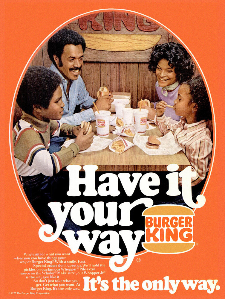
Burger King 1970s “Have it your way” ad
Graphic design in the 1970s saw an evolution in advertising. In this era, close-up faces of people declaring their devotion to a product became the norm. Cartoons and drawings are filled with anthropomorphic characters. Photography also became more popular. Photos were often dazzling or in grayscale. Collages were also widely-used together with eye-catching typography. The sullen, starkly-drawn housewives of the 50s were also replaced with perky human beings.
Illustrations didn’t disappear, but it became a part of photography to enhance it rather than something on its own. Since photography and people vouching for a product became the norm, celebrities were also used to endorse products. Since advertisements made use of real people more often, it also made sense to use famous people to promote a brand.
Typography in the 1970s also developed due to the availability of typesetting technology. This technology made revolutionary typography possible. In this decade, typography was used to combined with photography to create attractive graphics. Everything was bold and bright. Elements such as 3D styles and large letterings were the standard.
The postmodernist design also began to emerge in the 1970s. Designers started to adopt rejected historical styles. They experimented with them, making them more exaggerated and fun. The 1970s was a great decade to try new things with graphic design and test different styles.
Influentical People
Graphic design in the 1970s was shaped by brave artists who dared to explore new forms of expression and visual communication.
Neville Brody

Milton Glaser, I ❤ NY logo, 1977
Neville Brody’s designs were new and untested. He aspired for a new kind of magazine art that goes against traditional printing and design methods. In his work, he wanted to reflect and represent the changing landscape of London during his time. He believes that taking inspiration from the current climate can help shape you as a designer.
Milton Glaser
Milton Glaser is one of the most popular and celebrated graphic designers of all time. His work, the world-famous “I Heart NY logo” was designed during the 1970s. Even Glaser did not anticipate just how “iconic” his work ended up to be, not only for New Yorkers but for people around the globe.

Peter Saville, Joy Division - Unknown Pleasures, 1979
Peter Saville
Peter Savilled worked for Factory Records in the late 1970s. Ever since then, he became a pivotal figure in graphic design and style culture. He helped establish a new standard in creating and designing album covers. With his bold, expressive, and elegant style, he was able to identify images that epitomise the moment. His work included Joy Division’s iconic Unknown Pleasures cover. His designs are so compelling that they strike the same emotional resonance as the music on the albums he’s worked on.
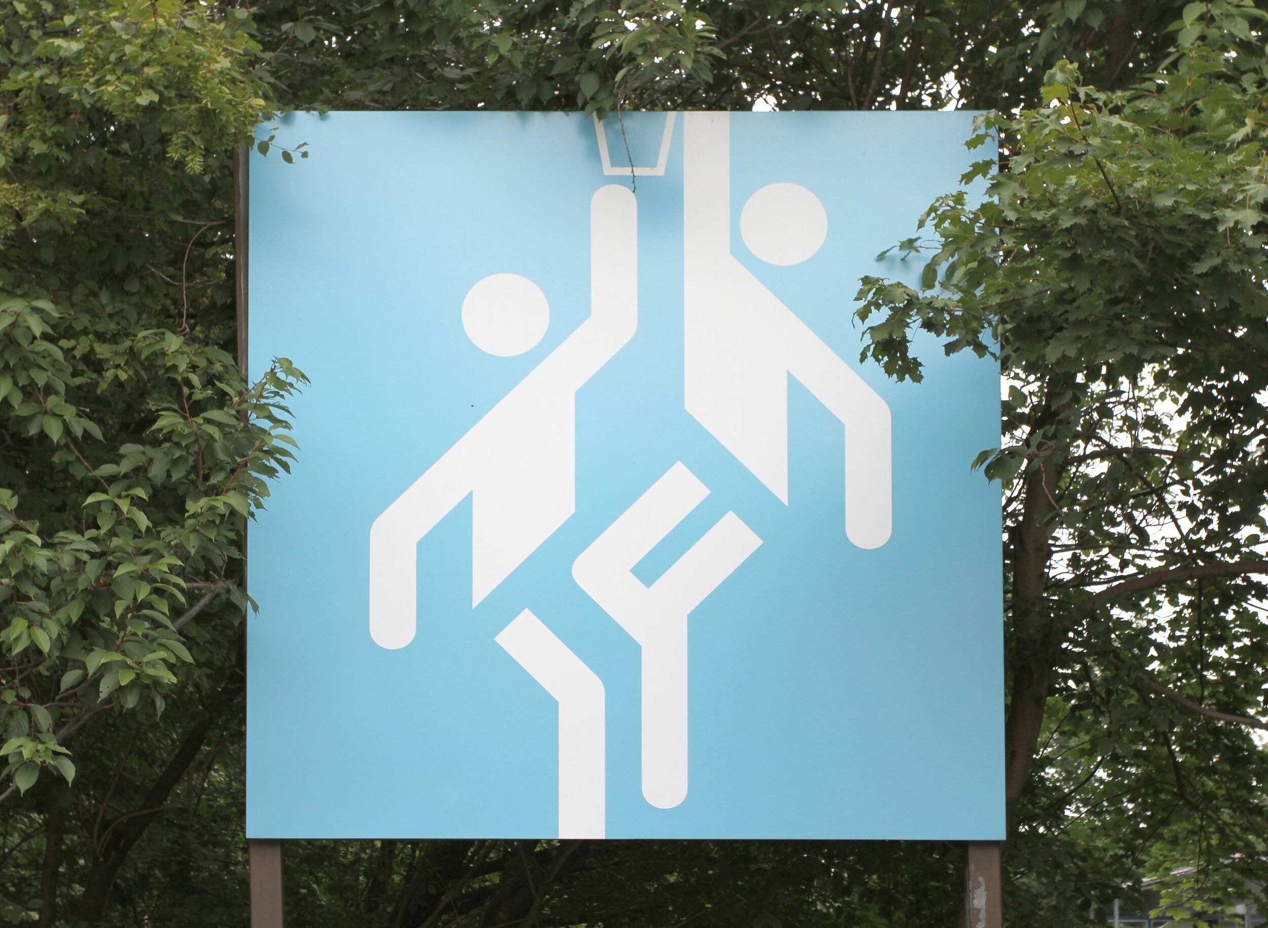
Otl Aicher
Otl Aicher is a German graphic designer and typographer who is best known for his work for the 1972 Summer Olympics. He boldly used pictograms and mixed it with a bright palette developed from the color of the Bavarian system and a strict grid system. With these elements, he managed to create stunning visual identities that earned him his reputation in graphic design. He is also known for creating an influential public signage system that utilised a simple stick figure graphic. Design elements of this system are still widely used today and remain influential in the field of graphic design.